The Worst Spaceship Of All Time Is On A New Sci-Fi Show
Spaceships are one of the best things about science fiction. When they’re done right, they become cultural icons, like the USS Enterprise.
It’s not about whether or not your ship is ugly. Sometimes ugly is exactly what you want. Ships like Serenity and the Millennium Falcon are awkward and ungainly looking, on purpose. Giving them that aesthetic makes them the lovable underdog you want to root for.
Sometimes, ugly and stupid is just ugly and stupid. When a fictional starship is designed badly, it’s usually because the ship in question is part of a sci-fi project that’s as bad as it is. And yet the worst sci-fi starship ever created is, somehow, not part of the worst piece of science fiction ever made. It’s on a kind of good, new science fiction series called The Ark.
The Ark has aired a second season and it’s not clear yet if the show will get a third. Produced by SyFy and streaming on the Peacock app, The Ark has been a modest success. With the end of shows like The Expanse, Star Trek: Picard, Star Trek: Discovery, and Star Trek: Lower Decks, it’s one of the only outer space sci-fi shows still being produced.
Before we take a look at the hideous exterior of this flying nightmare that is the show’s main setting, we need to explain why it exists.
The Premise Of The Ark
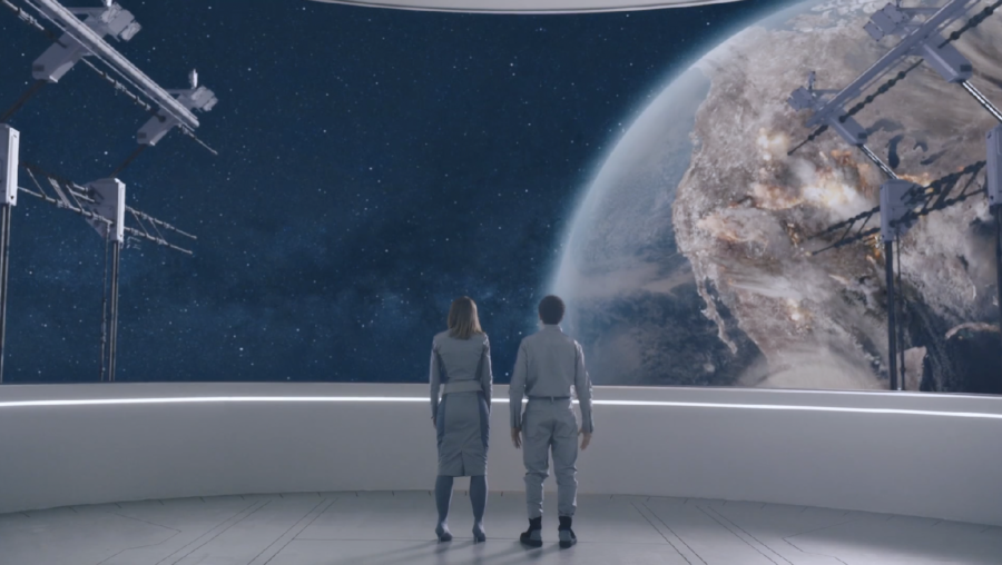
The Ark is set in a future where the Earth is rapidly becoming uninhabitable. The whys and hows of this aren’t all that important and aren’t fully explored by the show. What matters is that humans need a new home and so The Ark program was conceived to build ships that would take us somewhere else.
The series begins aboard Ark One, flying through space mid-mission. The crew is in stasis for the long voyage, there’s a disaster, and most of the command crew is killed. The survivors wake up, and the only people left are junior officers and civilians.
The show follows their journey to make it to their destination, with the odds stacked against them. It’s basically a redo of the now all but forgotten 1970’s sci-fi series The Starlost.
Ark One’s Terrible Design
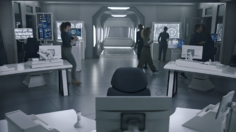
If you see Ark One’s interiors, you may not think the ship is so bad. The interior design is generic, white, future-stuff.
Sure, the bridge looks like office computers sitting on foldable card tables, but it’s easy to overlook. Shot from the right angles, these problems aren’t so noticeable.
It’s on the exterior, that Ark One turns into a total disaster.
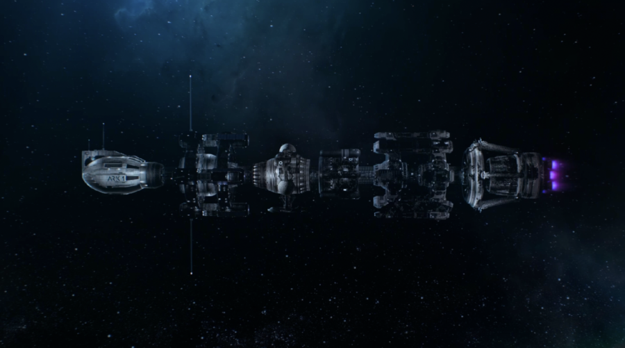
The aesthetic failures of this design could be dismissed as being due to an attempt at realism. That excuse won’t work, because that’s not what’s going on.
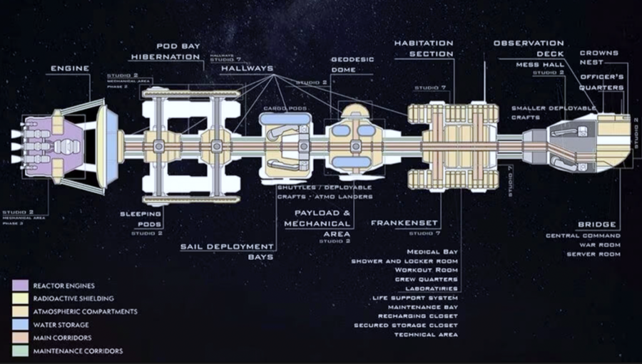
For instance, those spinning rings may look like they are there to create gravity with centrifugal force. They aren’t. This is where the stasis pods were kept. Once everyone wakes up, they never go in that section of the ship again. Instead the crew spends all its time in the parts of the ship without any gravity creating spin, and yet there seems to be plenty of gravity in them.
So why the spinning rings then? No idea, they’re just there and no one on the ship ever mentions them.
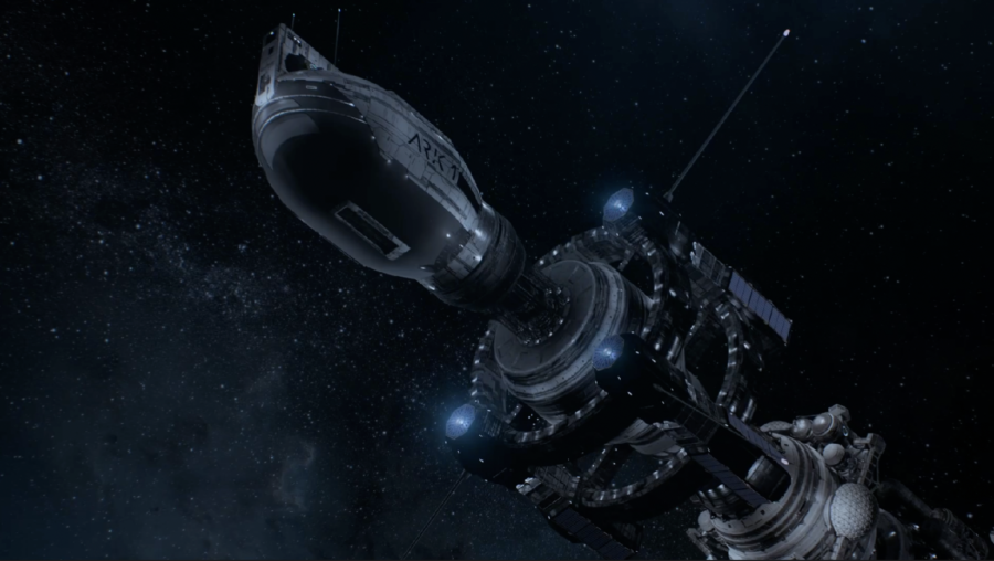
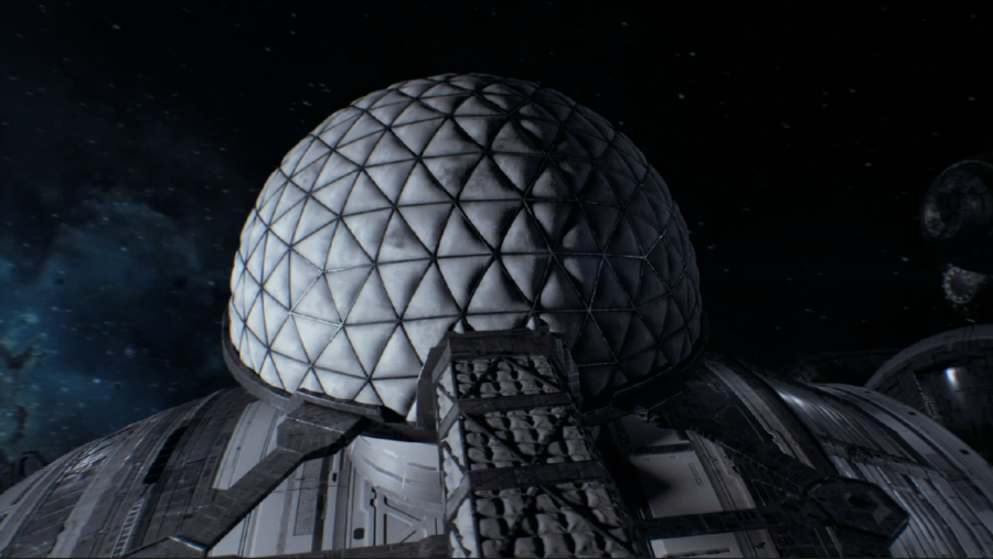
That’s the case with most of Ark One. Nothing about it serves any purpose. The Ark’s hero ship is a bunch of non-specific pieces jammed together for no reason. The people inside the ship don’t seem to know most of it, outside of the command area at the front and the very strange biodome on top exists.
The biodome, by the way, also makes no sense. When running out of food, the crew decides to grow crops in there, because it’s a big open space. Why was a big, empty, exposed, dome-shaped area on top of the ship? It’s never addressed.
The dome wasn’t originally designed for plant growing, since it’s not transparent to allow light through. Whoever designed the ship decided it needed a big, empty dome stuck on it, in a way that it was fully exposed and easily damaged.
It’s also unclear why the ship has stasis pods or why the entire crew was sleeping in them. Once the accident wakes them up, they seem to be able to activate the ship’s hyperspace drive and get almost anywhere in a few days or hours. In fact, along their journey, they encounter other identically ugly and stupid Arks, all of which have fully active and awake crews.
If there’s anything good about Ark One’s design, I guess it’s that it is, indeed, unforgettable. Usually, bad starship designs are bad because they’re boring or generic. Maybe the design team didn’t put much thought into it, but Ark One isn’t boring.
Ark One’s Failed Aesthetic Spreads Like A Virus
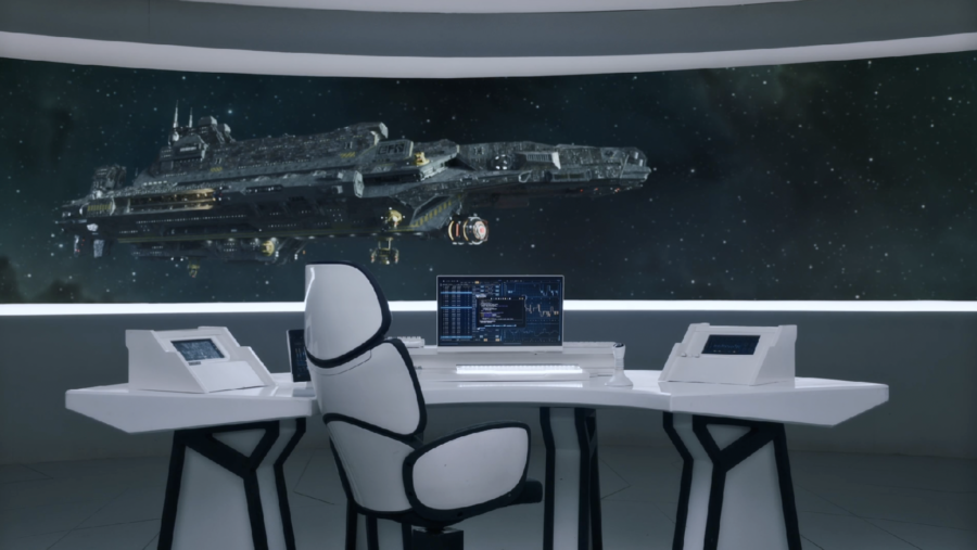
They also encounter another type of ship, which is ugly in a totally different way. It looks like a flying brick with weapons pods attached to it. At least it doesn’t have pointless, spinning rings.
This brick ship was created for season 2 of The Ark. By then the show’s producers should have known the ships they were designing were horrible and ugly. That knowledge aught to have prompted a drastic change in direction. Instead, they kept Ark One’s existing aesthetic and painted it on a space-faring cinder-block.
The Ark Shows Off Its Ship With Bad Music
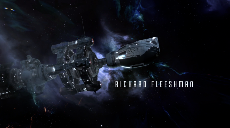
So Ark One is stupid, ugly, and makes no sense. Normally, with a ship this bad, any standard science-fiction show would try to hide it. After all, maybe they had a budget problem and couldn’t help it. They did build the bridge out of folding tables, after all.
Nope.
The team on The Ark thinks this is a good ship. We know that because they created an opening credits sequence solely devoted to showing off the show’s horrible ship. And then, somehow, they managed to find music that sounds as terrible as Ark One looks.
Why Bad Design Is A Big Problem
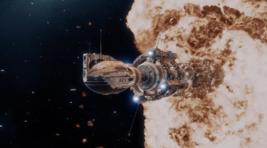
Ark One’s design is a huge problem for the show and one that, at this point, is impossible to solve since nearly every moment of every story takes place aboard Ark One. That’s a shame because, as I said at the outset, aside from how stupid the ship is, The Ark is not that bad.
Give it a couple more seasons to dial things in and I could even see the show becoming great. But it’s nearly impossible to convince anyone to watch it if the first thing they see when they turn it on, looks this bad.
At least the shuttles aren’t terrible.
The Ark Does Other Things Right
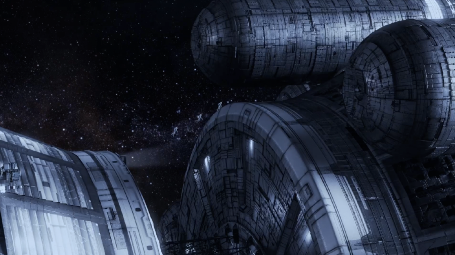
I want to stop complaining here and give the team working on The Ark some praise. While I do think this is the worst ship design in the history of science fiction, bad music aside, the way the show’s team is using it, is fantastic.
Ark One is always well-lit, so it’s easy to see. No cheat shadows to hide bad CGI. Space shots are plentiful and well-framed.
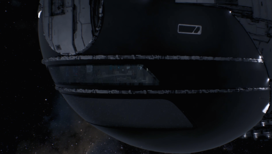
The Ark does a great job of showing the audience what’s going on both inside and outside the ship. The show is particularly good at using exterior establishing shots to focus the audience on where the action is happening inside the ship. Much of the show’s direction, from episode to episode, is top-notch.
You shouldn’t fault their special effects team for Ark One’s problems. They’re doing the best work they could possibly do, in a situation where they’re saddled with such a terrible design. It’s Ark One’s design that’s the problem, not the show’s execution.
It makes this problem more frustrating. If the ship had been good, the way they were using it could have resulted in some of the best sci-fi space scenes ever shown on television.
What Went Wrong? The Ship’s Designer Speaks
Wishes won’t fix it though, and the ship isn’t good. It wasn’t good from the moment someone first drew it out on a piece of paper. So, what really went wrong here?
The ship was designed by Randal Groves, who gave some interviews, seemingly unaware he’d created an embarrassment. Groves claims the design was the result of an attempt at scientific accuracy, apparently unaware that nothing about this ship is accurate.
Reading between the lines, it sounds like the original plan for the show was to have parts of the ship where the crew is weightless. However, when it came time to shoot, they didn’t have the budget to actually do that, so The Ark nixed it and went with artificial gravity all over the ship.
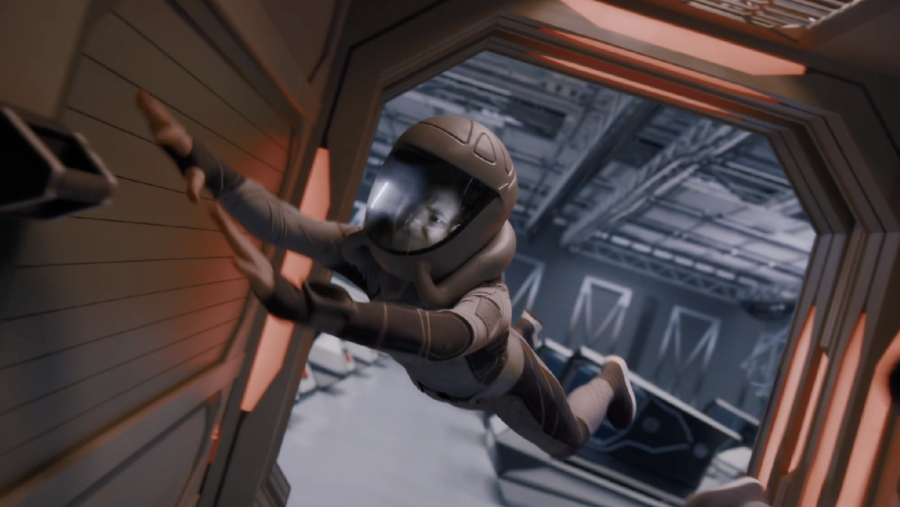
Unfortunately, they also didn’t have the budget to update the ship to fit their new, more budget-friendly scripts. That could explain why Ark One makes no sense, but it doesn’t explain why it’s ugly.
Groves says he went deep, looking at films like Star Wars, Silent Running and The Black Hole for a vibe check on what this future world might look like. I don’t see any Star Wars in it, but Silent Running makes sense as a reference. That movie’s ship is also a contender for the ugliest sci-fi monstrosity.
Groves says they also aimed to mix the “clean aesthetic” of Space X’s ships and gear, along with marine design cues. So it’s Elon Musk’s fault?
Give The Ark A Chance
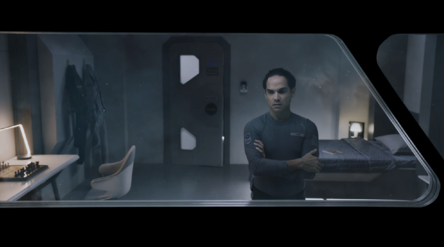
How The Ark made it all the way to television with a hero ship this dumb and ugly, will likely always be something of a mystery. Do your best to ignore it and watch the show anyway. Because, really, The Ark is sort of good.
In an era with extremely limited new space sci-fi options on television, it’s worth supporting, even if the ship is dumb and ugly.


Login with Google