Did Star Trek Build Deep Space Nine Backwards?
Did they get it all backwards? Does the station's design make no logical sense? We beam over and get an answer.
Is Deep Space Nine built wrong? That’s a question many Star Trek fans have asked for a long time.
If it’s an argument you haven’t heard, well its probably because you have a job and kids and things and haven’t spent enough of your time thinking about the pylons.
But some Star Trek fans have. And even if you haven’t, you’re going to want to know what’s going on here, before you spend any more time watching Deep Space Nine.
The argument against Star Trek’s most iconic space station goes this way.
Those haters, claim it makes no sense for the station’s pylons to curve inward since that limits the size of the ship that can fit in the space between the docking port on each pylon. A proper station, some argue, should have the pylons curving outward, and in reality, no one would ever design a space station this way.
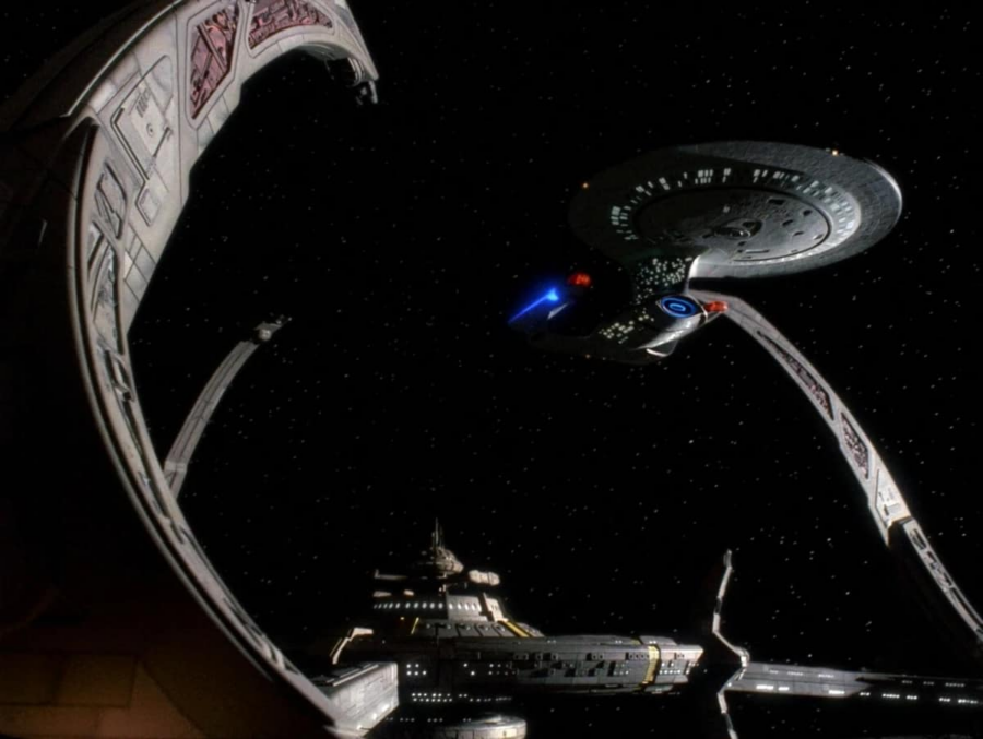
Here’s why that’s totally wrong. The station was designed by Cardassians. Cardassians, as a people, are not only warlike but extremely strategic thinkers. Curving pylons outward makes it much harder for the station to defend all of the ships docked at it.
In order to protect ships on outward curving pylons, the station would have to generate a much bigger shield bubble. A larger shield bubble results in more power usage and as a result, also in a much weaker shield.
By designing their station so that the pylons curve inward, the Cardassians came up with a way to allow ships to dock and also keep them safe beneath Terok Nor’s (the Cardassian name for Deep Space Nine) shields. Deep Space Nine doesn’t just look cool, it’s a design that’s totally functional and logical given the station’s intended purpose.
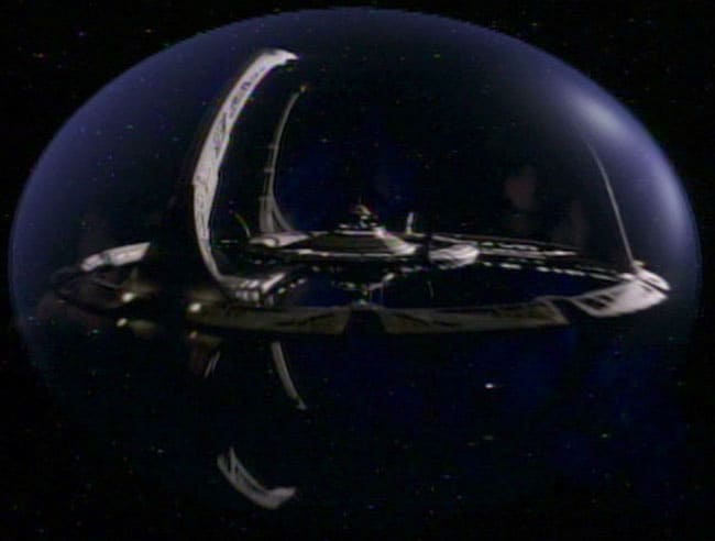
It was production designer Herman Zimmerman who originally came up with the design for Deep Space Nine. The station was designed to be Cardassian in origin from the beginning, which is why it looks so different from all the Federation technology we’re used to seeing in other Star Trek series.
The final look of the station wasn’t the first idea pitched, however. Talking to Star Trek Magazine in 1999, Zimmerman had this to say about coming up with DS9’s look…
“We started out charged with getting a “Tower of Babel” concept of a space station built over a couple thousand years of separate, disparate cultures, so the technology from one part of the station to another would be of various ages and various cultures, not necessarily interfacing one with the other, and there was this sense of confusion because of that.”
Early concept art drawn by DS9 co-creator Rick Sternbach reflects that initial direction.
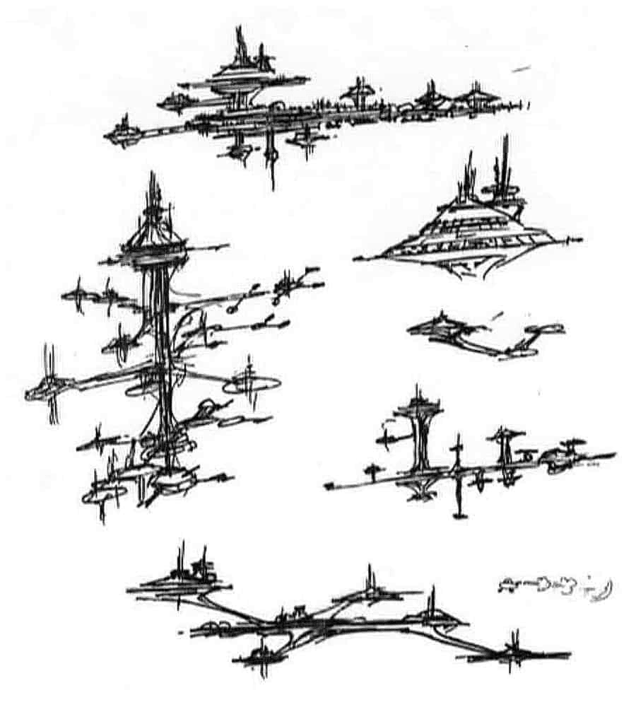
“The initial take on it was that it was a very old, ancient type of station — maybe not symmetrical in shape”, Sternbach explains.
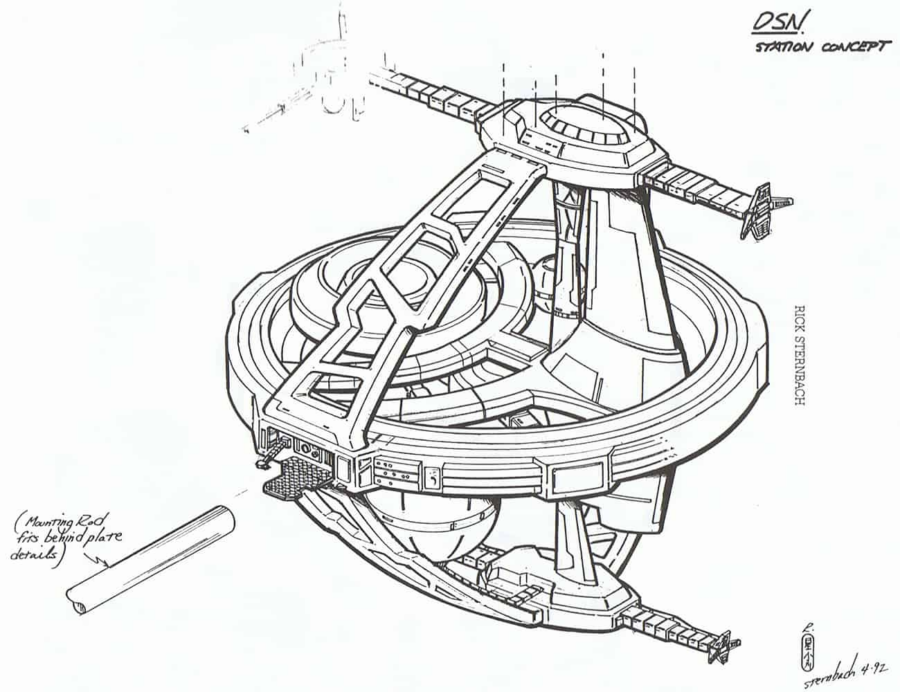
Eventually, they realized the tower of Babel idea was too messy. Instead, they decided to start over and go for something as alien and non-Federation as possible. That design evolved into a series of hoops…
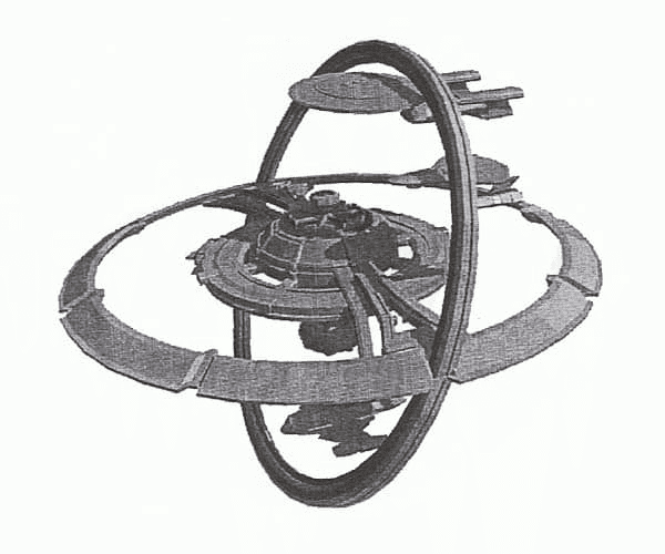
That hoop aesthetic means they never considered having the docking ports flair outward. Why is unclear, perhaps they simply realized early on that curving them inward made more logical sense…
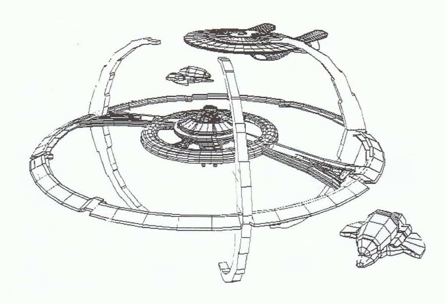
From there, those sketches eventually evolved into the Terok Nor we all know and love. This, at last, was the first image of Deep Space Nine ever seen by the public. It was used in a series of publicity photos promoting the show…
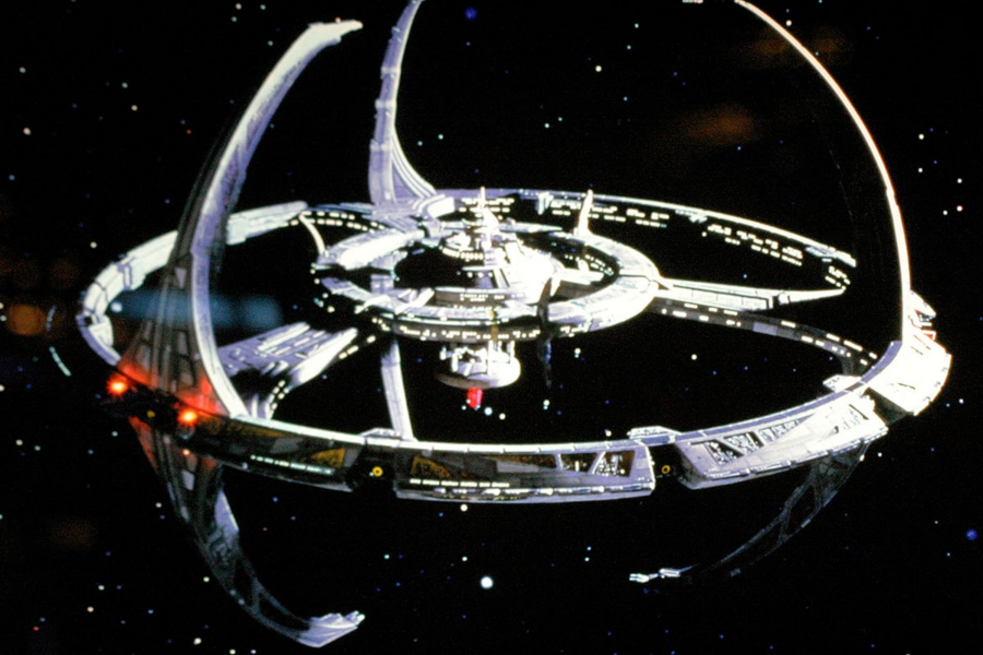
Deep Space Nine is a great design, one of the most unique in science fiction history. There’s never been anything quite like it, before or since.
Now, give the station its due. Circle around, and pretend you’re in awe of the pylons.


Login with Google