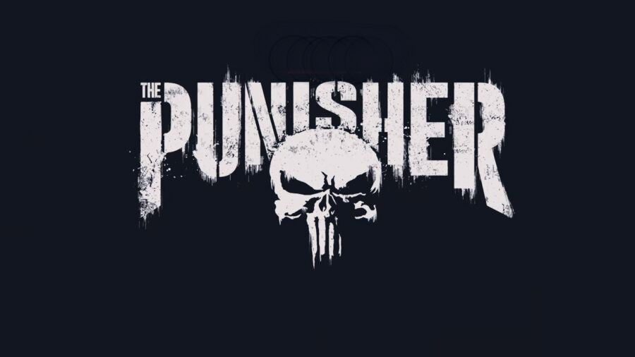
The Punisher Logo Has Been Replaced, See Frank Castle’s New Look
Although The Punisher's new comic is on the way, the newly redesigned logo has been revealed to the world. This new redesign might divide fans.
This article is more than 2 years old

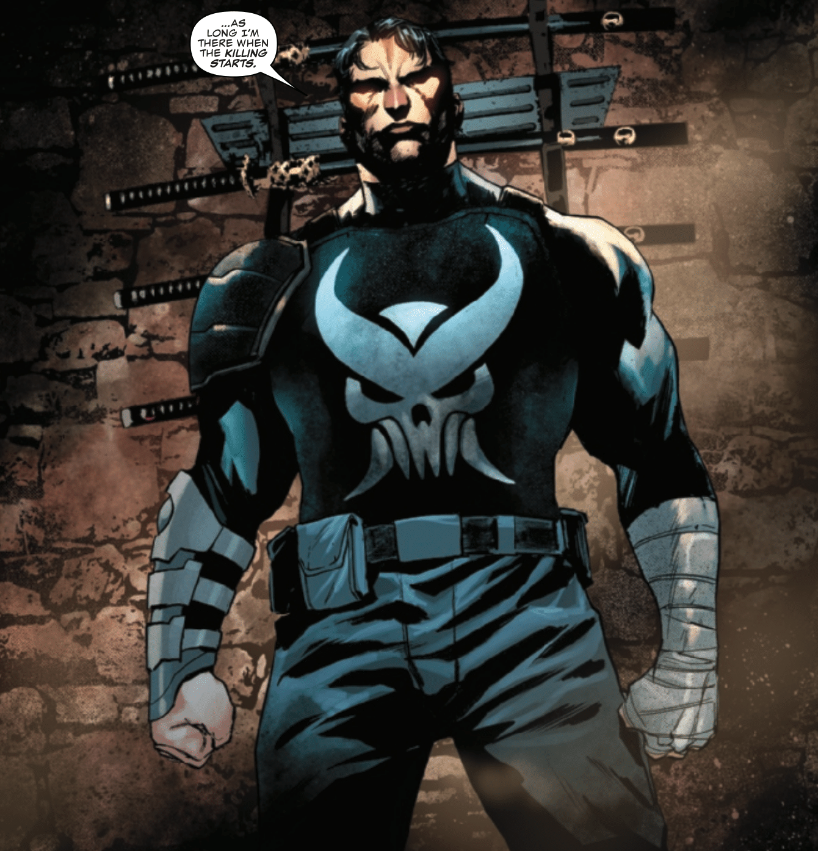
Easily one of the most controversial happenings in comics is the redesign of The Punisher logo. While the long-standing Frank Castle white skull logo has been synonymous with the anti-hero, it certainly might be time for a change. The logo and Castle both appeared for the first time in The Amazing Spider-Man #129 back in 1974, making an icon of both the character and his gritty logo. This detail has gone unchanged for over 40 years. Now the first look of the new redesign of Frank Castle and the logo has dropped in Daredevil: Woman Without Fear #3. You can see the photo below:

The Punisher logo might have gone through a transformation due to recent events, but the change might also be heavily due to the character change within the comics. This next part is spoilers, so for those who are avid comic readers, look away. The Punisher is going through quite a bit of a transformation as of late, and the above redesign might be due to his new role. Frank Castle is now part of the widely known ninja organization, The Hand. Fans of the comics and especially the show will recognize The Hand as the secret organization that tries to stop both The Punisher and Daredevil in both of their Marvel Netflix series. As you can see from the above picture, it seems as if the redesign is said to reflect more of an aesthetic that might be aligned with The Hand. Also, Elektra refers to Castle as, “my lord,” so the logo could reflect The Punisher’s new title within the organization.
Another big reason as to why The Punisher logo has been redesigned has a lot more to do with the fact that the logo has been adopted by real-life authoritative figures. Politicians and cops have been known to blast the logo on their cars, equipment, and uniforms. Anyone that understands Frank Castle would also understand that he is one of the biggest anti-authority characters in existence. The logo had also been adopted by many of the people who took part in the Capitol Riots. The attention had been brought to Jon Bernthal, who quickly condemned these actions and the usage of the logo. This redesign might just be in response to these happenings and the political division within the U.S. and people seemingly adopting the logo for the wrong reasons. Whatever the case is, this new logo does look threatening, with a more martial arts type of motif added. Giving Frank Castle guns and even higher-level fighting capabilities might be a bit unfair though.
The Punisher #1 is set to debut on March 9th, but the above redesign has made its way into the comics already within the story of Elektra taking on the mantle of Daredevil. This sneak-peak new look of The Punisher logo might divide fans. Honestly, it doesn’t look too bad. If this logo is meant to stay, there is no telling if it will be adopted by all mediums. Fans are still hoping to see Jon Bernthal return as The Punisher in the MCU, but if his portrayal of Frank Castle is set to sport this new logo is another question altogether.


