The Hilarious Hungarian Star Wars Poster Changes The Franchise

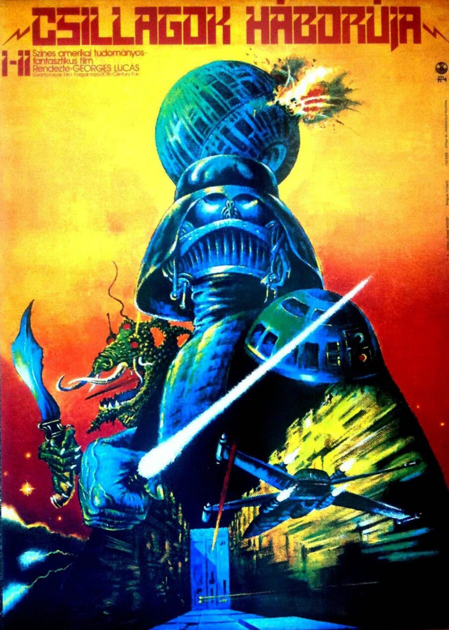
When it comes to movie promotional material, we usually get straightforward looks at the upcoming film, or at least some images that lend themselves to a little bit a mystery. That’s how promotional campaigns tend to go. But then, sometimes, you head to another country in the late 1970s and get something so wild and out of context that it makes you question everything. That was the case with the Hungarian poster for Star Wars: Episode IV – A New Hope.
As we saw with the Russian Star Wars posters, these countries just kind of did their own thing when it came to interpreting the movies. Did it matter what was actually happening on the big screen or how George Lucas’s flicks actually looked? Apparently not.
Check out the Hungarian Star Wars poster and see for yourself.

Um, what?
If this poster for Star Wars is to be believed, Hungary in the late 1970s must have been one hell of a party. Seriously, how else could you explain this dazzling mess of a one sheet? It practically screams, “I’ve been up all night doing hard drugs!”
Maybe it’s just us—it has been a year or two since we’ve actually watched A New Hope—but can anyone recall the scene with a scimitar-wielding dragon?
You’d think that would be a memorable moment in the canon. Perhaps it’s one of those scenes that George Lucas always wanted to include in the script but didn’t have the technological capacity to pull off, and maybe the poster artist was working from a script and hadn’t seen the movie. Yeah, that sounds like a plausible explanation.
This poster is such a frenetic, jumbled mess of iconic bits from Star Wars. There’s so much going on. Darth Vader looks like a character from a short-lived ’70s cartoon for children, and R2-D2’s head definitely resembles a futuristic shoulder pad. Plus we get a dagger never before seen in Star Wars, colors that are unlike any palette LucasFilm ever conjured.
Oh and don’t forget the ending spoiler shown right there in the Hungarian Star Wars poster where the Death Star is actually exploding. I mean, come on people. Pull it together. This poster just went all wrong in all the worst ways.
As our world becomes more interconnected and globalized, these multimedia occurrences are few and far between. Sure, some countries change an image (or scene) here and there if it doesn’t align with their cultural proclivities. But at least the themes (and characters) are the same throughout.
This is what made the 1970s and 1980s such a wild time. Apparently, anyone could just do whatever they wanted when it came to making stuff. Even for a massive flick like Star Wars, there was a creative license that made it feel like everyone was just operating in a totally different dimension. Frankly, I kind of miss it.


