Netflix Redesign Is Streamer’s Biggest Interface Change In Years
Netflix is making one of its biggest UX redesigns in recent memory. The new experience is an update for the homepage of the streamer’s TV app. Based on the Verge’s report on the new design, the tiles with show and movie titles will automatically expand when you scroll to them and show you information about the series, the title, and the trailer if you hover over the title for long enough.
The Netflix redesign seems like an attempt to give users more information in a sleeker way. Currently, those using the TV app can scroll to TV shows and movies, and then the trailer and information will show at the top of the interface. With this new design, everything is a little more consolidated.
An Easier To Use Interface
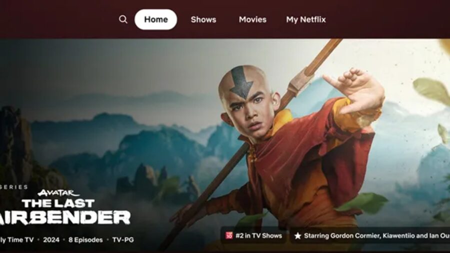
Along with the trailer and synopsis of the title, the Netflix redesign will also give you information like the release year, number of episodes, and the genre. It seems like the redesign is an attempt to help focus viewers’ attention and help them choose something a little quicker, as Netflix’s senior director of product, Pat Flemming, explained, “We often see members doing gymnastics with their eyes as they’re scanning the home experience.”
We all know the feeling of scrolling Netflix endlessly to find something and then eventually giving up or just going with something familiar, so this design may help people who have choice paralysis when streaming.
Menus Are Easier To Navigate

In addition to Netflix’s redesign for scrolling titles, the new design also nixes the pop-out menu on the left side of the homepage. Instead, it features a homepage menu at the top of the screen that gives you options like search, home, shows, movies, and My Netflix. You also don’t need to scroll all the way up to the top to access the new menu, as you can simply click the back button on your remote to jump straight to it.
A New Category
Eagle-eyed users may notice that Netflix’s redesign of this menu also drops some of the options that were previously part of the left pop-out menu, such as the categories, new & popular, and my list buttons. My Netflix is the only added category, which is a button that was originally added to the Netflix mobile app. The My Netflix category allows you to browse content recommendations based on what you’ve watched, along with easy access to recently watched or saved titles.
Small Changes Add Up

For those who like the “categories” button, you can still access it by clicking “search” in the new Netflix homepage redesign. But, if you’re interested in trying out the new design for yourself, you may have to wait a bit, as it’s still in the early rollout phase. The design is set to be tested in a small subscriber group using smart TVs and streaming devices, with Flemming saying that it could be rolled out to most other users if the reaction to the new design is positive.
In any case, it seems like the new Netflix redesign is just slightly different, though it remains to be seen if users feel like it’s a better experience. Some people get annoyed by the constant slick animation and movement of the streaming interface while some like it. Maybe in the future, streamers will give us the option to pick our own preferred interfaces.
Source: The Verge


