Star Trek Just Fixed Everything Wrong With The New Enterprise, Then Threw It Away
If animation can get it right, why not live-action?
The new Enterprise design featured on Star Trek: Strange New Worlds is one of the greatest starship designs of all time. It keeps all the right things about the original design while updating it in a way that could never have been done in the 60s. The result is a design much like the 60s Enterprise, but better and more realistic except for one thing.
The color and patterning being used on the Enterprise in Star Trek: Strange New Worlds is a disaster. In its first appearance way back on Star Trek: Discovery season 2 the ship also had a weirdly paneled hull, however it was also lighter in color.
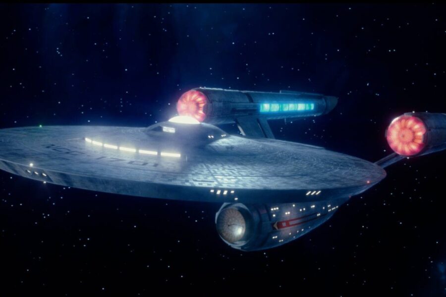
On Star Trek: Strange New Worlds that Discovery model of the Enterprise got some minor tweaks. What they did to the hull was largely to make it look gray and dirty and, well, terrible…
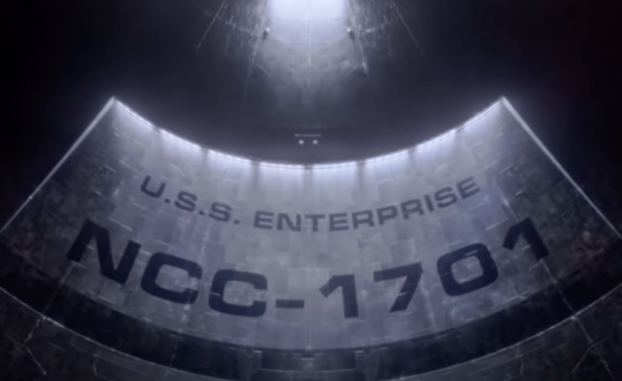
All that changed last week with the Star Trek: Strange New Worlds episode “Those Old Scientists”. That episode featured a new opening sequence of the show, one redone by the animation team over at Star Trek: Lower Decks. What they accomplished was nothing short of a revelation.
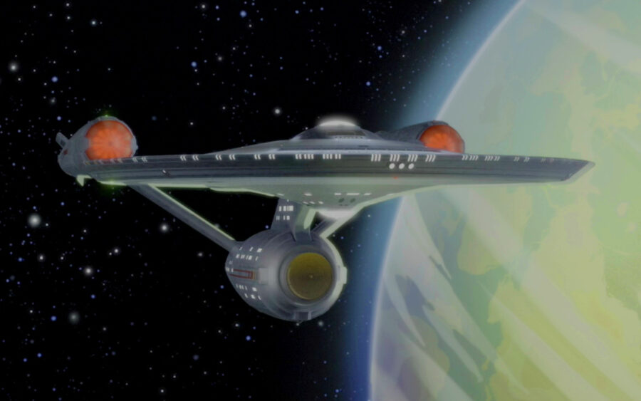
The animated version of the Enterprise is an exact duplicate of the live-action one in every respect save one: The hull. Instead of a mess of patchwork gray and dark shadows that obscure the design, they delivered a version of the ship with a smoother white hull.
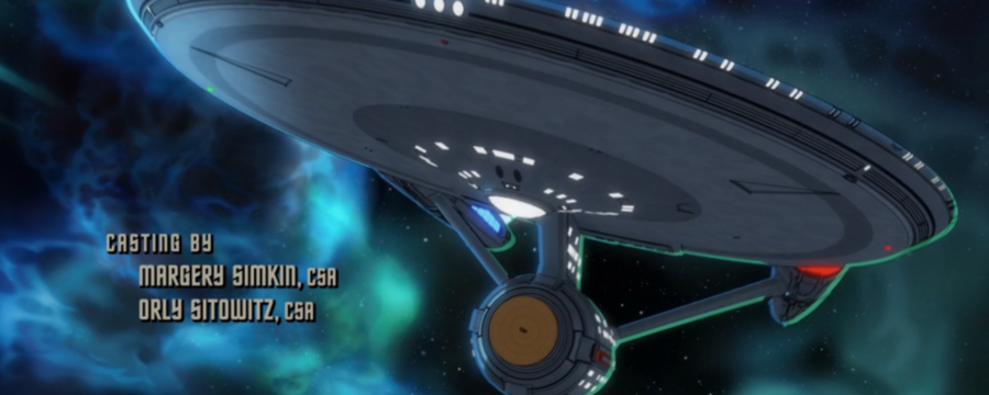
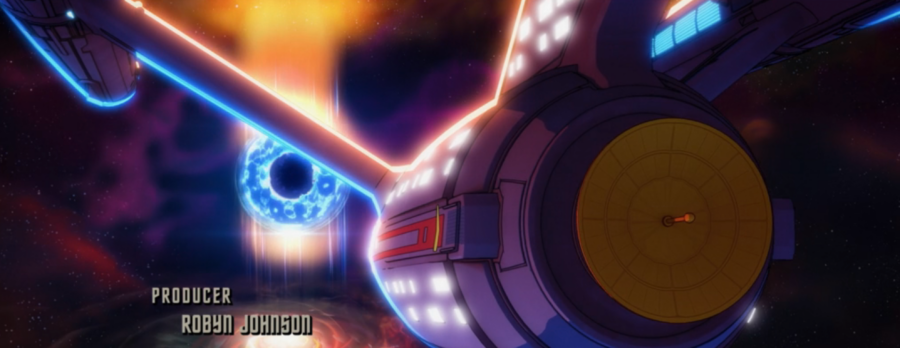
This new hull color is not only more in keeping with the way the original Enterprise has been in every other incarnation (TOS and the refit version of the Star Trek movies), but it’s also far more futuristic and sleek looking.
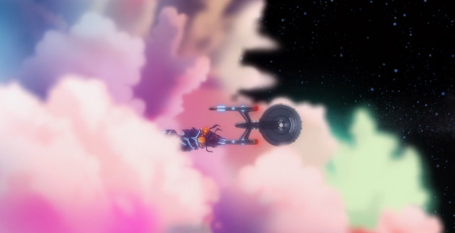
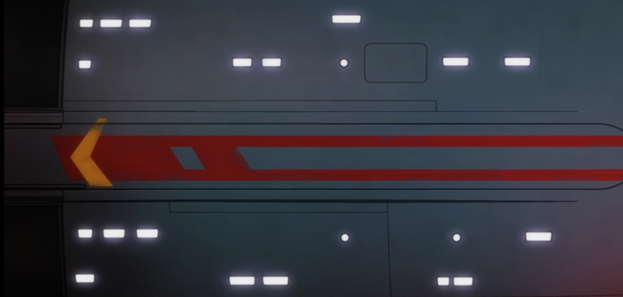
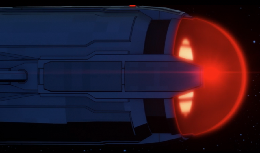
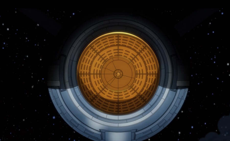
A messy patchwork of dirty metal plates does not scream future. Look at your iPhone. Then look at these two versions of the Enterprise. I think it’s clear which one looks more futuristic…
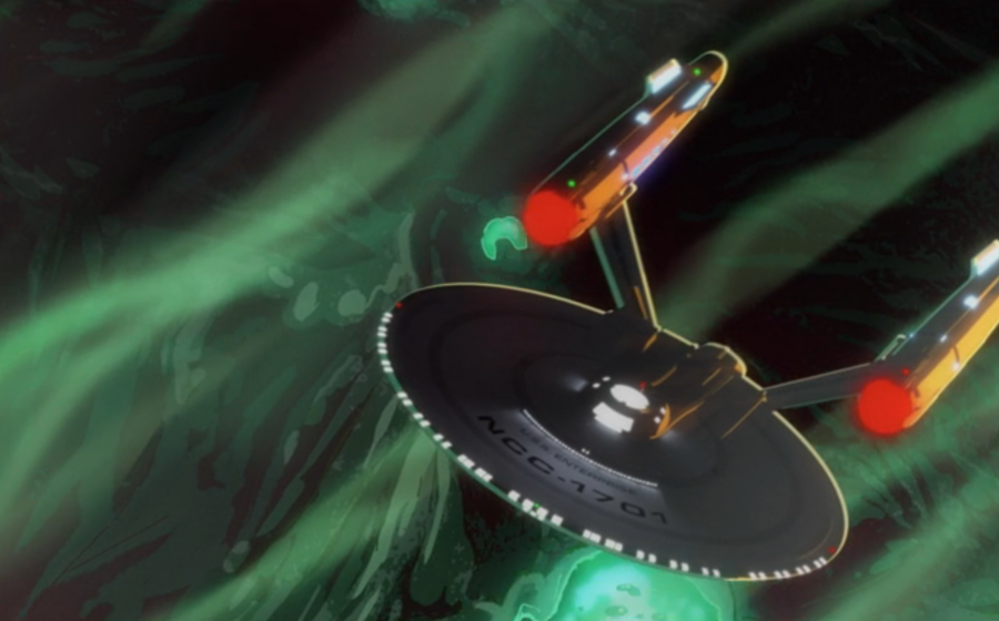
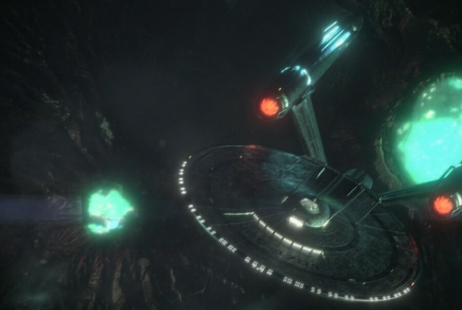
Unfortunately, the animated opening with better lighting and far superior hull plating was a one-off. In the show’s next episode, we went right back to the old opening and the old live-action model of the Enterprise. We went right back to dim, dark lighting that obscured all of the ship’s details and an exterior hull that looks like it was repurposed from the roof of a metal shed.
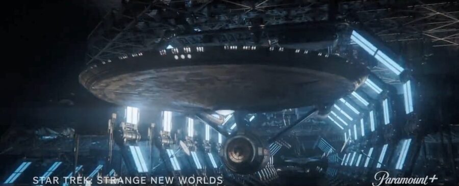
The original, first-ever Enterprise design was created by Matt Jefferies. It was meticulously crafted to depict a vessel that epitomized the optimism of space exploration in the 1960s. Her saucer-shaped primary hull, nacelles, and engineering section showcased a sense of elegance and functionality, while its iconic “Starfleet arrowhead” insignia emblazoned on the hull symbolized unity and exploration.
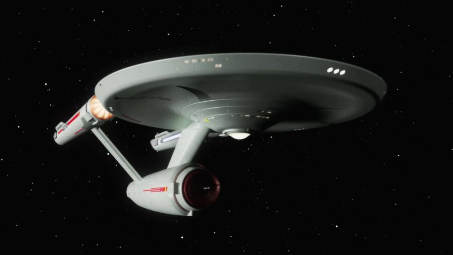
To portray the futuristic capabilities of the starship, Jefferies implemented a concept called “The Star Trek Look,” a design philosophy that aimed to break free from conventional spaceship portrayals of the time. The Enterprise’s bridge was strategically designed with a minimalist approach, utilizing colored buttons and screens that communicated information in a visually appealing manner.
For the Star Trek movies, the Enterprise was redesigned to look better on the big screen. That version kept the aesthetic of the original while giving it an art-deco feel. The refit version of the Enterprise is now widely regarded as one of the best sci-fi ship designs of all time.
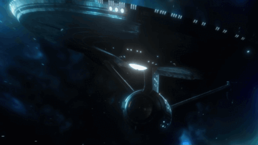
This new ship version was designed by legendary Trek starship creator John Eaves. He did brilliant work and is definitely not responsible for the ship’s terrible lighting or hull plating. That’s the work of the Strange New Worlds FX team, who, for some reason, have decided they’d like to make his beautiful design look as bad as possible.
Here’s hoping Strange New Worlds opts for a brighter Enterprise exterior in Season 3. It’s not too late to get it right.


