DC Studios Corrects Decades-Long Problem And Fans Are Ecstatic
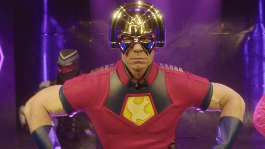
If you were excited by all of the Marvel news that came out of San Diego Comic-Con this year, I am genuinely happy for you. All I cared about, however, was a single announcement from James Gunn. The director and co-head of the new DCU recently unveiled the official DC Studios logo. Surprise, it’s the old DC bullet!
The New/Old Logo
After almost twenty years of questionable logo decisions, including that weird one with the folded “D,” James Gunn is bringing back the only seal of quality I and many other nerds want to see.
Whatever worries I had about the DCU vanished the second James Gun revealed that classic symbol as the DC Studios logo.
Oh, I’m sorry. Is that not as exciting as Robert Downey Jr. returning to the MCU? Is the return of a beloved logo a letdown after the Fantastic Four: First Steps trailer?
Allow me to explain why such a seemingly trivial thing has DC fans pumping their fists and shouting “Lets goooooo!”
The Creation Of The Logo

Marvel Comics’ logo is essentially their name in a specific font. Yawn. DC, on the other hand, has always tried for something a little more dynamic, and none have been as dynamic as the new DC Studios logo.
The DC Bullet was the longest-running logo in the company’s history, adorning everything from comics to toys for almost 30 years.
In 1976, DC commissioned Milton Glaser, the artist responsible for the iconic “I Love NY” logo, to design something that would take DC in a “bold, new direction.” Glaser’s new logo took the company’s initials, tilted them, and surrounded the letters with a thick band featuring four stars.
The design is simple, elegant, and, most importantly, synonymous with DC for three decades.
The Legacy
And that new DC Studio logo wasn’t just the company’s logo for a random three-decade stretch. No, it was the most important thirty years in DC’s history.
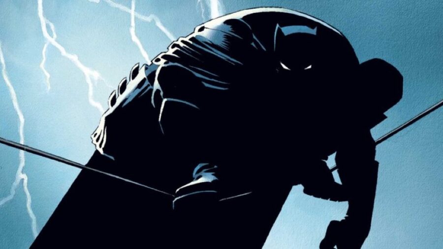
The DC bullet was the company’s symbol during the period when comic books grew up and became mainstream. It was the DC logo that appeared on every issue of Watchmen and The Dark Knight Returns.
Meanwhile, the DC bullet adorned the packaging of every action figure in the DC Super Powers toy line. It was on every pair of Superman Underoos and all the other DC merchandise in the ’80s and ’90s.
To Gen X and Millenials, that symbol is more than just the new DC Studios logo. It’s hope. Hope that James Gunn has our best interests at heart.
The Return Of The Best Versions
You’re probably thinking, “Great, so DC is going to cater exclusively to middle-aged nerds now?” And honestly, I don’t think that’s the case.
I’m pretty sure James Gunn chose the DC bullet as the DC Studios symbol not just for nostalgia but also for what it represents.
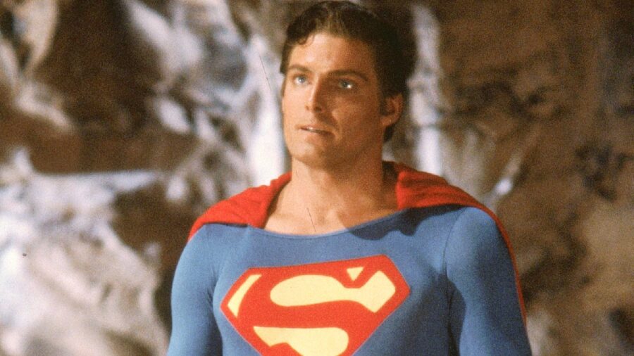
For many fans, that symbol represents the best versions of Batman, Superman, Wonder Woman, etc. The ’70s, ’80s, and ’90s took what was great about these heroes from the ’40s, got rid of the bad, and boiled the characters down to their essence.
The version of Batman people think of when they talk about the character beating any for with enough prep-time came from the DC Bullet era, as did the Big Blue Boyscout version of Superman.
The Promise
When James Gunn unveiled that DC Studios Logo he made a promise to dedicated DC fans everywhere. A promise to do right by these cherished characters that haven’t always been treated right by Hollywood. A promise to honor the core of DC’s heroes while simultaneously bringing them into a new cinematic age.
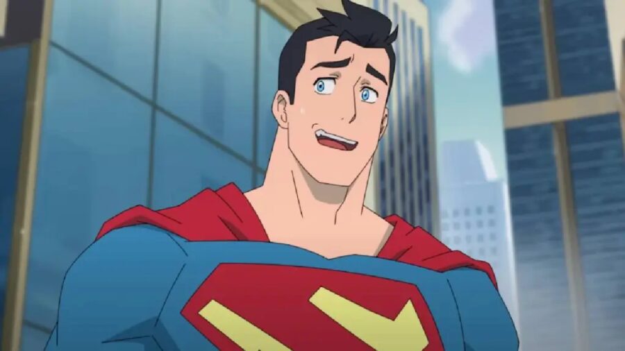
I don’t know about you, but when Superman comes out next year, I intend to be there on day one to see if Gunn keeps his promise. Until then, I have something I haven’t had regarding DC movies in a long time: hope. And it’s all thanks to one silly little logo.


