RoboCop, Terminator, And Other ‘80s SF Classic Get Classy Stained-Glass Makeover
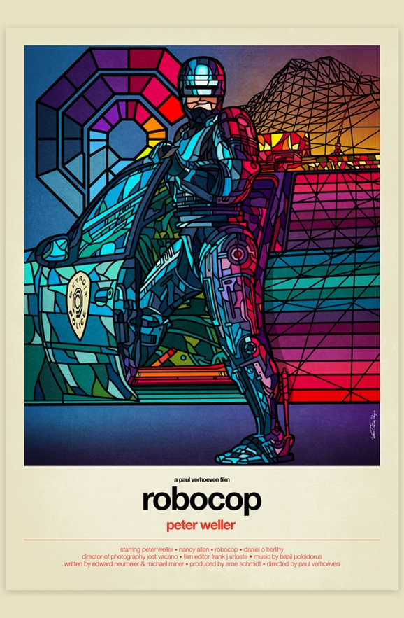 Yet again, the Internet has served up something I didn’t even know I needed. We’re forever discovering new and creative ways the artists of the world are riffing, remixing, and referencing some of the beloved films of our very favorite genre, and it should surprise no one that we’re really quite infatuated with the stylish stained-glass makeover designers Van Orton gave classic ‘80s flicks including RoboCop, The Terminator, Back to the Future, Blade Runner, and more. I’m tempted to build a cathedral just so I can commission real glass versions of these. I’ve always wanted to start my own church. Look out, world, here comes The First Orthodox Church of the Immaculate Robot!
It’s one of those ideas that just sounds odd at first blush, but the blends of spectacular color do make for some striking images, especially if you imagine them rendered in actual glass, with sunlight cutting through in multi-hued shards. Hell, that RoboCop one up top is easily a more impressive visual than any of the actual movie posters for the upcoming reboot.
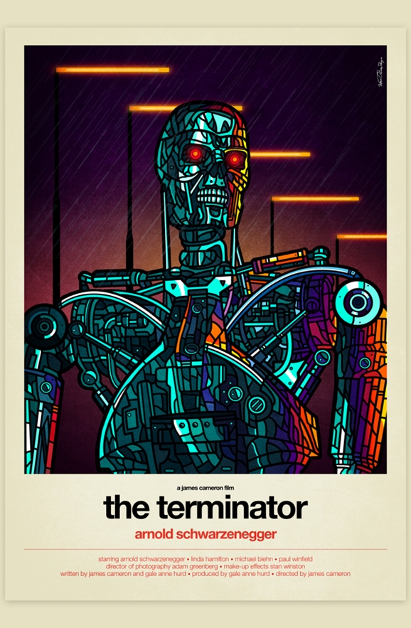
It’s interesting to me how Van Orton chose the designs for each of these. Much as I do love the concept of these, I think the specifics of some of the images could have been better. For instance, the Terminator one above is nice enough, but it’s kind of a bland choice. “Here’s the Terminator in the rain, but in stained glass.” It strikes me that they could have chosen an iconic moment from the movie, such as the killer cyborg emerging from the burning semi — the first time we see the full endoskeleton exposed. That would have been amazing, and the flames in the background would have lent themselves to all manner of colorful flair. That’s just me nitpicking, though, these are still damned impressive.
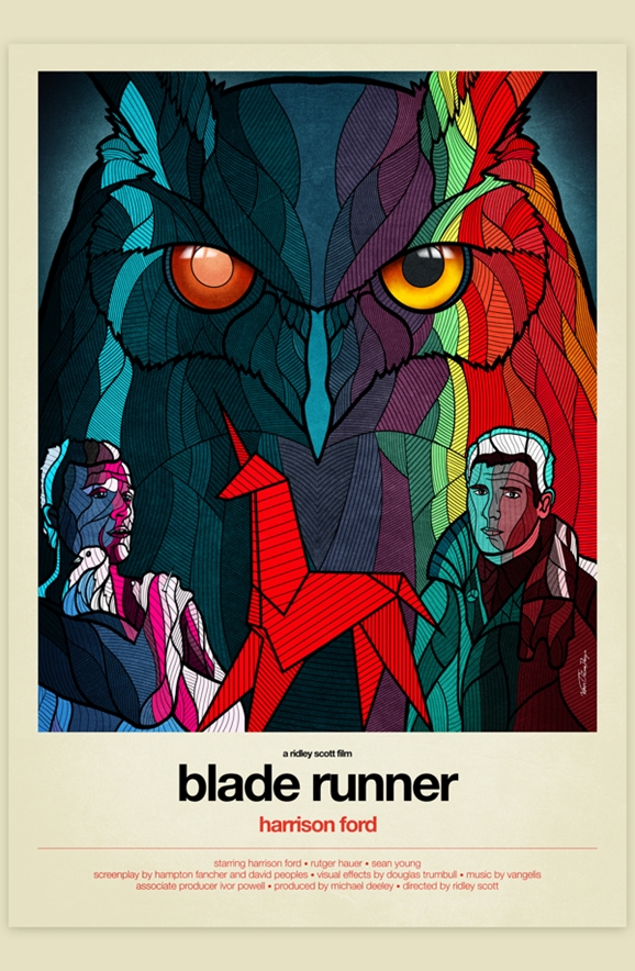
I like this Blade Runner one a lot better. The way they suggest sunlight and shadow on either side of the artificial owl is really well done, not too mention the replicant “eyeshine” on the bird.
I know the images are meant to evoke movie posters, but the design of the surrounding white border and the credits at the bottom really make me think these look like novelizations you would have found of the movies in the ‘80s. That’s not a criticism, I really like the effect.
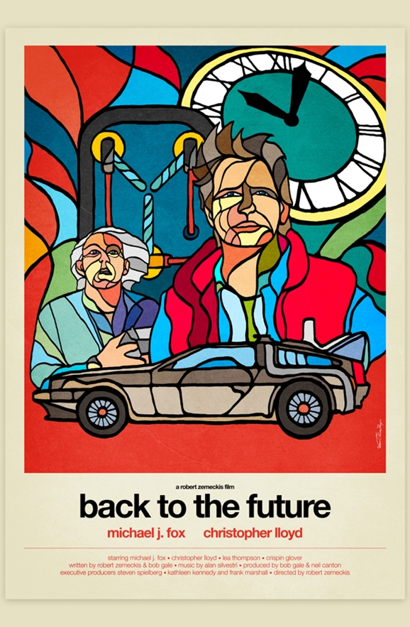
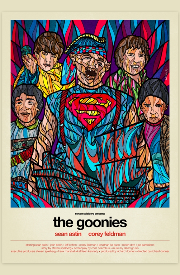
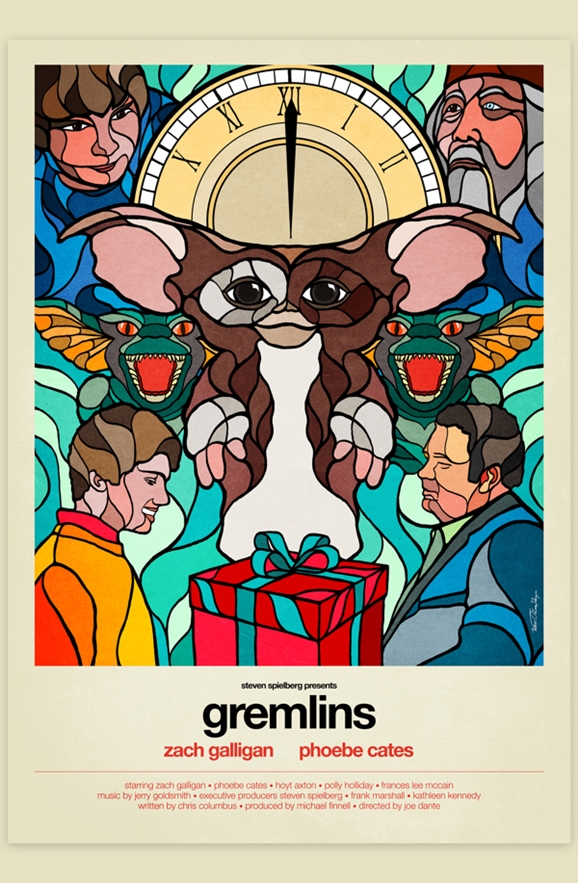
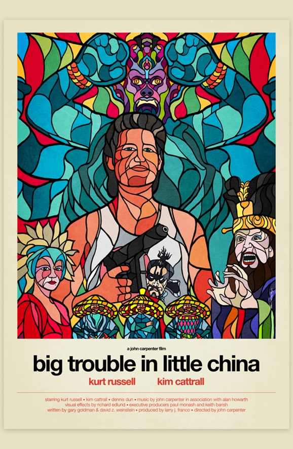
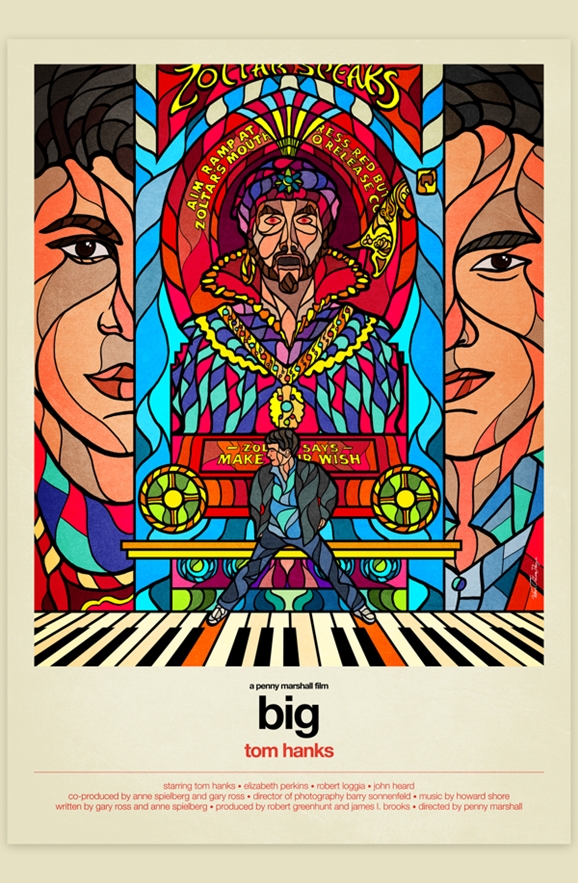
You can see more of Van Orton’s work on their Facebook page and official website. And while these don’t count as science fiction by any means, here’s the rest of the collection below, because we loves us some Goonies.
