The Star Wars Logo You’ve Never Seen Is The Most ’70s Thing Ever
Though the alphabet in the Star Wars logo that we all know and love is clearly written in the ITC Serif Gothic typeface, X user @TheSpaceshipper has recently posted one of the original prototypes that undeniably has a ’70s vibe. One of the things that we love about Star Wars, especially the original trilogy, is how timeless the science-fiction franchise has turned out to be. But this original logo design would have most certainly dated Star Wars in a way that would make us wonder why “Night Fever” didn’t make its way onto the soundtrack.
The Prototype Star Wars Logo Is Stuck In The ’70s
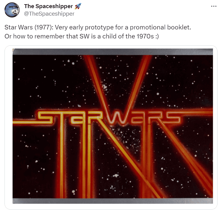
@TheSpaceshipper made a followup comment, stating that whenever he sees this version of the Star Wars logo, he hears Europe’s “The Final Countdown” play in his head. It’s worth noting, however, that this epic song that basically sounds like lasers produced by a synthesizer actually came out in 1986, but still evokes the same kind of vapor-wave aesthetic that the previously unseen logo resembles.
Other X users are loving the retro looking Star Wars logo, and @RustyBoyStudios went so far as to suggest that this should have been the final design because it’s so wonderfully chaotic.
Ralph McQuarrie Settled On The ITC Serif Gothic Font
But it’s probably for the better that the Star Wars logo went through a number of revisions before Ralph McQuarrie produced the logo that we know and love to this day. The impact that the ITC Serif Gothic typeface has had on pop culture is a clear enough indication that the art department knew what they were doing, and we couldn’t possibly imagine the original Star Wars trilogy pelting us with exposition in any other font.
While the original iteration of the Star Wars logo is fascinating to look at, it’s simply too busy, and just makes us want to bust out a disco ball and do the Hustle.
The Star Wars Logo Remains Iconic Decades Later
It’s not that a busy logo necessarily detracts from a film’s storytelling, but the title card is often what draws viewers in. The Star Wars logo that we’re familiar with is bold, simple, and easy to read, which is something that needs to be seriously considered if you want to put out a movie that has mass appeal.
We’re not saying that Star Wars’ legacy would have been tarnished if they ultimately ended up choosing the early prototype logo, but the visuals would have certainly dated the movie, and made it an obvious product of the ’70s rather than a film that transcends both space and time.
Imagining Other Famous Logos And What Could Have Been Disasters
But now that we’ve seen this early iteration of the Star Wars logo, we can’t help but wonder what other film properties went through similar logo revisions. Could you imagine a world where The Lost Boys logo, which is also timeless, had Flock of Seagulls lettering, or if the Pulp Fiction lettering had a grunge aesthetic? At the end of the day, a simple, timeless design is what wins over audiences.
Logos Offer First Movie Impressions
They say that you shouldn’t judge a book by its cover, but it’s worth noting that the title card is the first thing that we see as members of the audience. We have no doubt in our mind that Star Wars would have been just as successful if it had a different logo, but a younger audience would possibly need a push in the right direction to be convinced that Star Wars isn’t set in the ’70s because the only thing missing from the picture is a pair of bell-bottoms.


