The Best Star Wars Ship Design Is Meant To Look Truly Alien
There are few designs in sci-fi or film in general quite as memorable as the starships in Star Wars. The ships of the Original Trilogy look so great that the later prequels and sequels struggled to deliver any ships nearly as brilliant as the earlier ones. Those original designs were courtesy of the late, great Colin Cantwell, and he eventually revealed that the TIE Fighter design was deliberately meant to make it look alien and mysterious compared to other starfighters.
Echoes Of The Past
To understand the significance of the TIE Fighter design, you need to know more about Cantwell’s design philosophy regarding other ships. Some of them had very quirky inspirations–for example, the initial idea for the X-Wing shape came from a dart in a British pub that Cantwell was visiting.
Eventually, though, the X-Wing became part of a general aesthetic for the film–as the designer revealed in a Reddit AMA, most of the “early Star Wars vehicles were echoes of the Fifties.”
Visual Juxtaposition
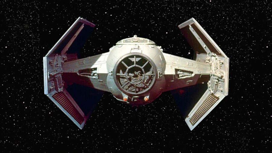
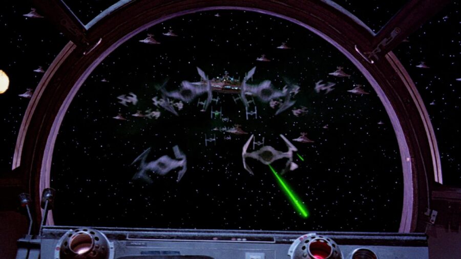
The big exception to this is the TIE Fighter, a ship that Cantwell knew needed to look different from the other ships. For audiences, he wanted this Imperial ship to be one that would be “instantly perceived as something Alien and somewhat timeless.”
This helped create an immediate visual juxtaposition: the Rebel ships would generally look familiar (the space equivalent of ‘50s hot rods, basically), but the TIE Fighter would look unfamiliar and therefore more threatening.
Speaking of threatening, Cantwell revealed that the panels on his TIE Fighter design were, first and foremost, meant to look scary. “Above all the ship and panels had to be mysterious and threatening.” He has a point, too: these Imperial vessels just look menacing in a way that other ships don’t, which is part of that first film’s overall visual language.
Villain Designs
Owing to its design as a fantasy film in space, the first Star Wars movie has some decidedly unsubtle visual imagery throughout. The white armor of the Stormtroopers makes them look like skeletons out of a child’s nightmare, and they are led by an insanely tall robot man in black with a death’s head mask.
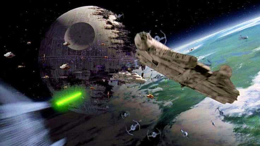
Even the Star Destroyers ooze villainy, as our first sight of this iconic design is when the giant vessel is flying toward a smaller ship like an arrow flying to its target.
The Visual Language Of Star Wars
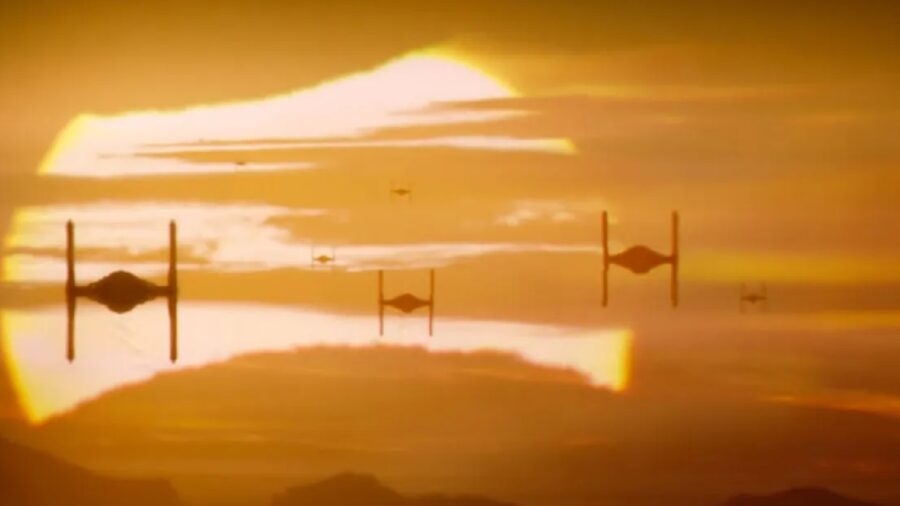
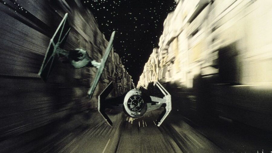
In other words, Star Wars has a visual language that makes perfect sense even when the volume is turned off. We instantly know who the good guys and bad guys are by how they look, and that extends to the ships they fly. The TIE Fighter design is part of that, as the starfighter looks alien and menacing as it tries to blow up one intergalactic muscle car after another.
Colin Cantwell
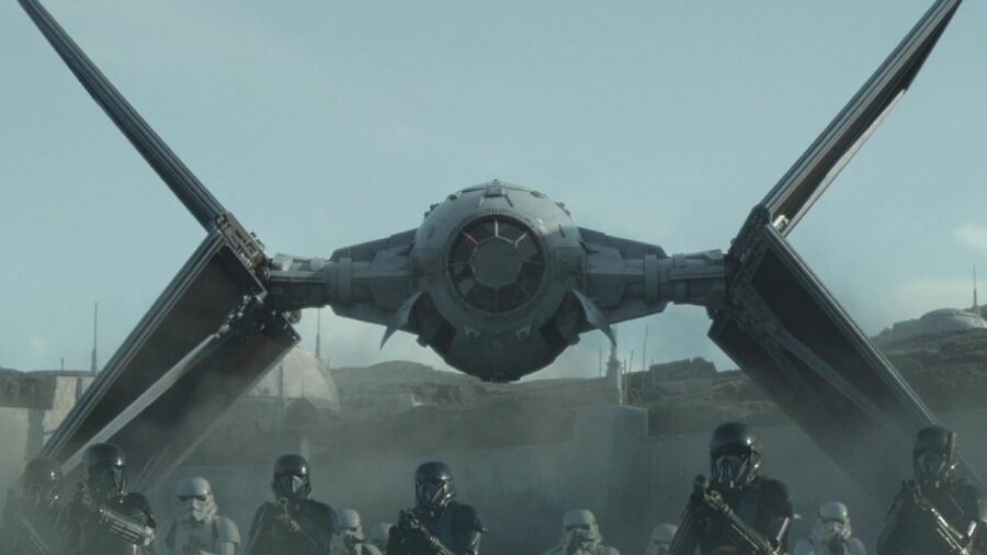
Sadly, Colin Cantwell passed away a few years ago–honestly, we wish we could still tell him how influential his TIE Fighter design has been, both to these blockbuster films and the imagination of the fandom. It established the Empire as the intersection of fascism and bureaucracy, and each ship channels the menace and malice of Darth Vader himself.
Without this ship design, Star Wars would never be the same, and anyone who doesn’t realize how important Cantwell’s contributions are needs to go back and review the soulless starship designs of the Sequel Trilogy.